Practice makes perfect
Good web design is no different than good graphic design, it’s all about selling an idea that the viewer can understand. In order to sell this idea, your website needs to be clear and easy to follow. Everything needs to be considered to make sure the idea gets across; from your text, color scheme, hierarchy, navigation and much more. Just remember to keep it simple. An over complicated layout is distracting and frustrating to look at. Let’s go over a few simple tips and reminders for good website dos and don’ts to improve visitor satisfaction.
Example: Ashen Blue IT
Structure
Do: Have a Plan
Always, always, always have a structure planned out. Even if you are using a web developer tool such as WordPress, it’s easy to get caught up in overdoing it without a plan. The first thing you need to figure out what the purpose of your website is about and then what you would like to add to it.
Just because you want people to know everything about you doesn’t mean that they have interest in know about your business. What you are about, what you are providing and what the visitor can do are the basic essentials of what your website can offer.
Dont: Not Have a Plan
Seriously, do not start off without a plan ahead of time. This goes for both developers and businesses. As a business, if you don’t know what you want or know what you want your website to look like you are essentially holding back the development of your own website and the developer’s time. As a business, it’s important to do your own research and provide a guideline as to how you want people to see your business.
The same goes for developers, especially those new to web developing. Getting all your client’s information is key in order to get back their feedback, which in turn will provide more information as to what needs to be fixed.
Organization
Do: Keep things organized
This goes for both organizing your files and your layout. Files need to be named accordingly, your layout needs to be planned out, utilize your keywords and all the information needs to be accessible. This not only helps with your search engine optimization (S.E.O), but will also make things easier for visitors to understand the purpose of your website.
Having a solid layout is key to any good, modern website. Contemporary web design consists of using simple boxes in order to compensate for responsive design across multiple devices. Typically, the top of a website will consist of a business’s logo, navigation bar and a main slider or video with the sub content divided amongst smaller boxes.
The most important aspect for any website is hierarchy, starting with the most important information, such a company name and logo, and working down to the details so that it is easy to follow. Following the same logic, we must apply this to the most important part of a website, the content. A website’s main content is its text as it provides the key information to get across the idea of what you are trying to offer.
Paragraphs must be brief and only a few sentences long as unending text can hinder a viewer’s experience by clogging them with unnecessary details. Remember to provide headers for each new section, line break paragraphs and break up excessive text with images or quotes.
Don’t: Forget to stay organized
Nothing can be more frustrating for a viewer than becoming stuck or confused when visiting a website because it is unorganized. As a business, you need to make sure your developer has all the information as soon as he can and in what order. As a developer, always keep your files organized and your layouts easy to understand.
It never hurts to keep things in check as it supports your website’s S.E.O. and provides a positive experience for your visitors. Just like hierarchy, emphasis is also a vital factor in your layout. The more content that you attempt to cram equally the less emphasized the remaining content will become.
Space things out, more content can easily go into a new page or be pushed back more to easy the potential risk of having a viewer feel overwhelmed.
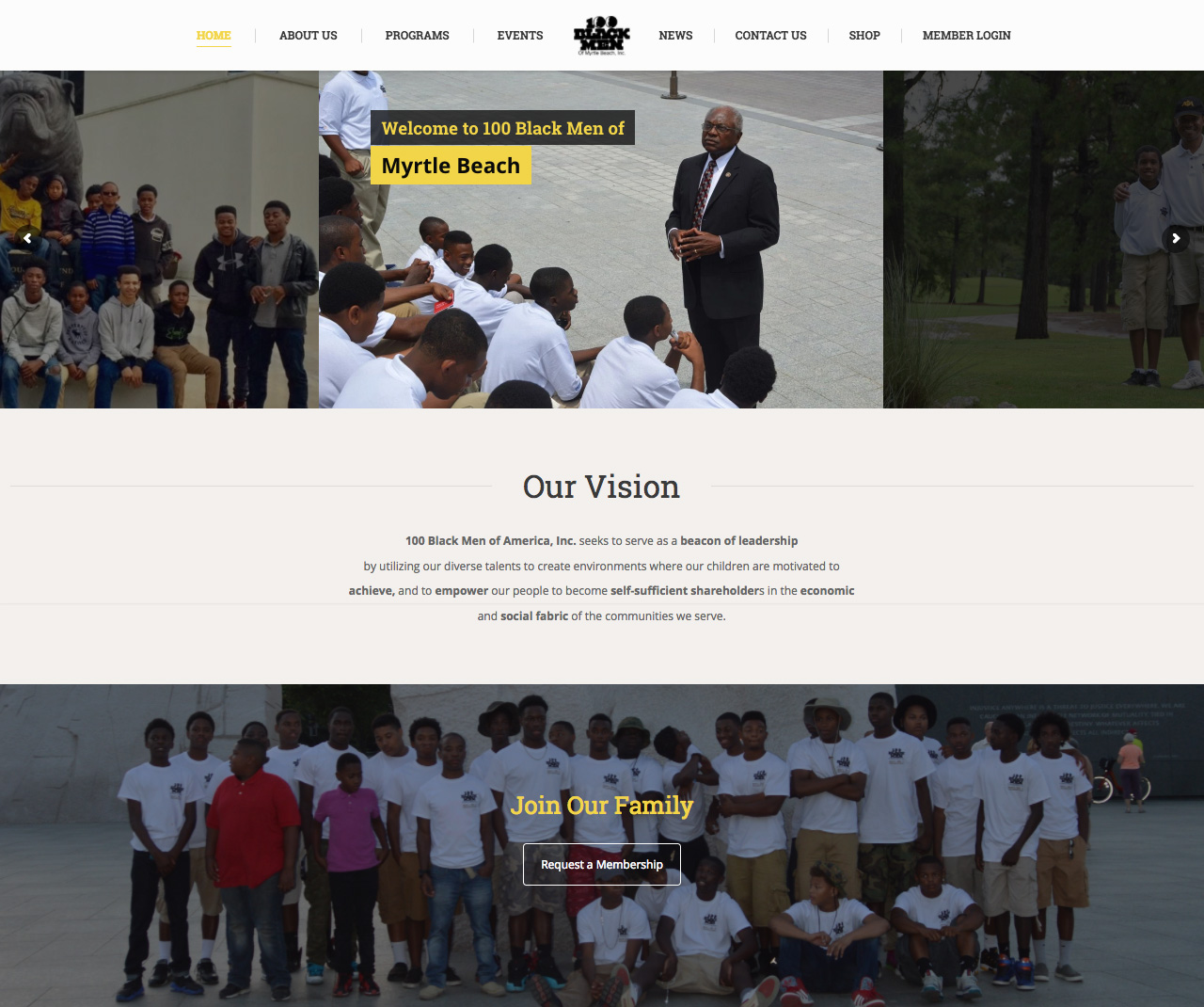
Example: 100 Black Men of Myrtle Beach
Consistency
Do: Stay on Topic
Consistency is another key factor in building a website such as color scheme, font choice, layout and so forth. Having consistency shows that you know what your business is about and how you want your audience to view it. This goes for your keywords as well, as this is not only useful for your viewers but for your SEO as well.
Let’s say you have a wedding photography business, then your keywords would have to consist of “wedding”, “photography”, “professional” and so forth. Of course you’d want to make sure you put enough about your work and how well trained you are somewhere, but if it begins to overshadow the needs for the target audience then you would not only lose your audience but your search rank as well.
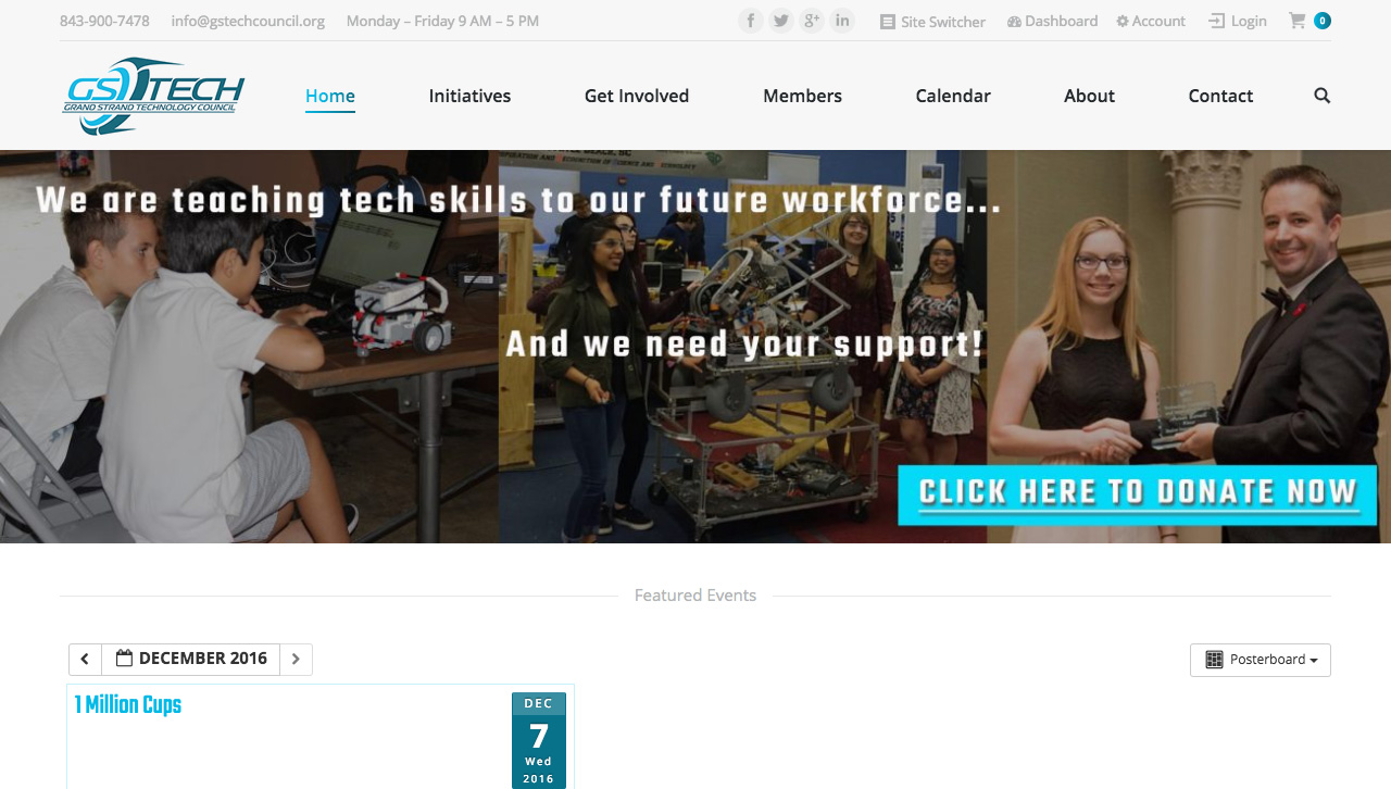
 Example: Grand Strand Tech Council
Don’t: Go off Topic
Anyone can start a blog and treat it like a diary, but that’s no excuse for a business to do the same. It’s about reaching out to people who want what you are offering. You may want people to know all about you and your business, but unless your name is Steve Jobs or Neil DeGrasse Tyson it’s better to keep things focused on what you are offering.
Getting back to consistency, it’s best not stray wildly from the topic at hand like over saturating a color scheme. Having too many colors is distracting and can interrupt the level of importance an item can get, such as giving color to a header and leaving the text a dark grey to distinguish the importance of the header.
Typefaces are typically be broken down between header, sub header and body text. Having three different levels allows for easier navigation and understanding of the hierarchy, such as headers using less text can have bolder, more complicated type versus body text having simpler, more legible type.
Without these differences, elements can blend into each other and become undistinguished from their respective emphasis.
Remember, Keep it Simple
There are many ways to make a good website but many more ways to do it wrong. When in doubt, the best thing to keep it mind is to keep it simple. If you’re not willing to go through the process of viewing your own website then perhaps it’s time to rethink your structure.


