
I Choose You, Helvetica!
You’re probably familiar with the word font, right? You typically throw it around as a term to describe the style of the lettering you wish to choose for your document. All those years of grade school taught you that you should the Times New Roman font whenever you have to write a report or document for class. Unfortunately, you like many others have been misunderstanding and misusing that word for what it really means. Fixing these missteps can help you improve your website’s legibility and help distinguish the appropriate typeface for what occasion.
A typeface is an assortment of glyphs that have one or more set of fonts in a similar design. To elaborate this further, glyphs are all the letters and symbols that make up a system of writing. For example, this not only included an alphabet but commas and question marks. What font really means is the size and weight of a typeface, such a bold or italics. Just like how there are different brush sizes, a typeface can have a wide variety of sizes from thin to thick and even compressed to wide. Helvetica is a classic typeface that covers this perfectly. It’s flexibility and simple legibility make it highly used in the graphic design world. Once you get familiar with its design, you might start noticing it more in the next billboard, sign or poster.
Keep it Clear
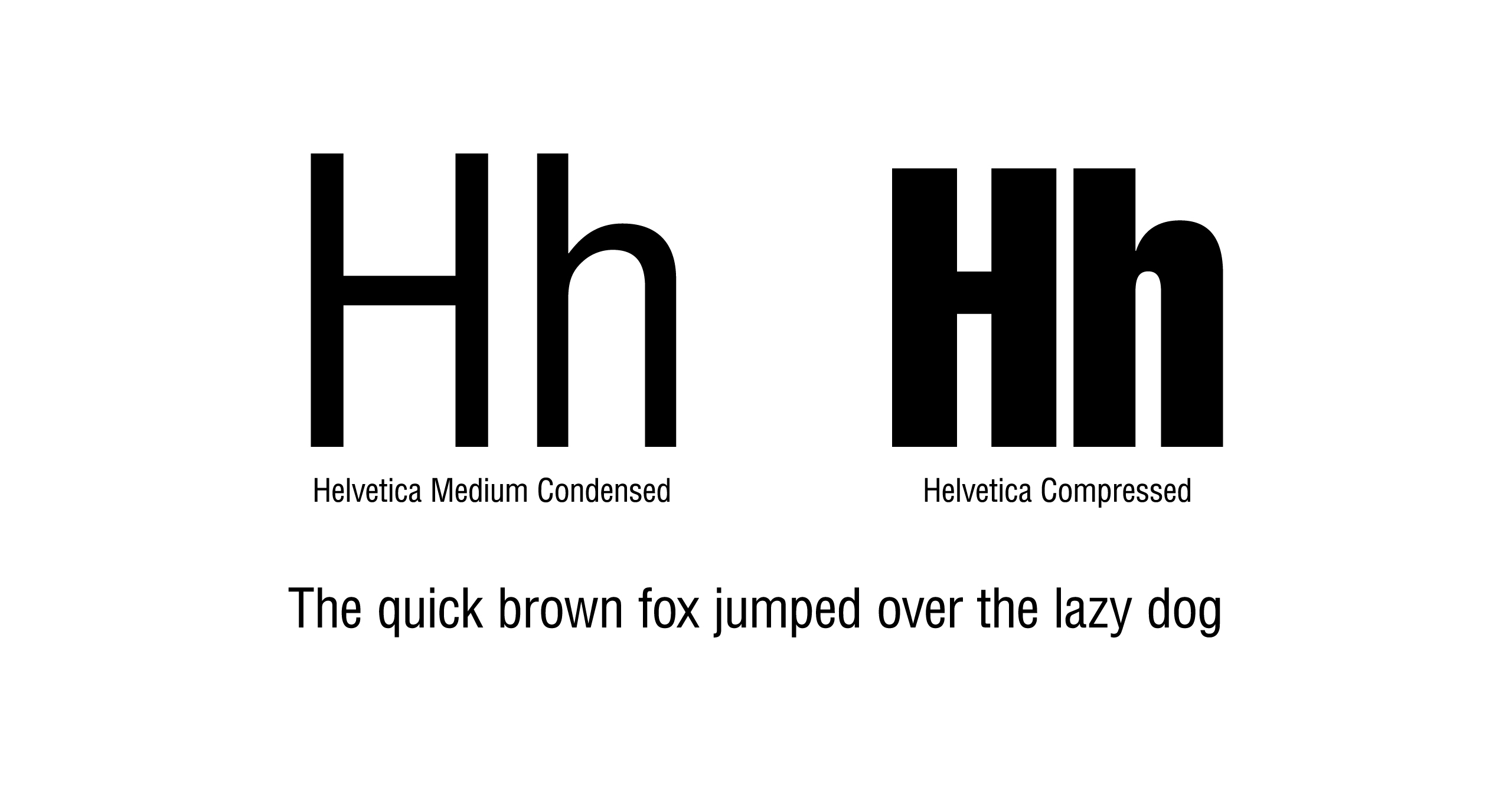
Having cleared up some of these distinctions, it’s time to talk about choosing a typeface. Most websites use a san-serif typeface, this means that there are no serifs attached to the ends of the letters like on Times New Roman. This gives the type an older and more legible feel for smaller sizes, like in a book. For most of everywhere else, san serifs are more likely utilized for short bursts of reading. This includes most modern websites, as it fulfills the roles for short headlines and slightly larger body type.
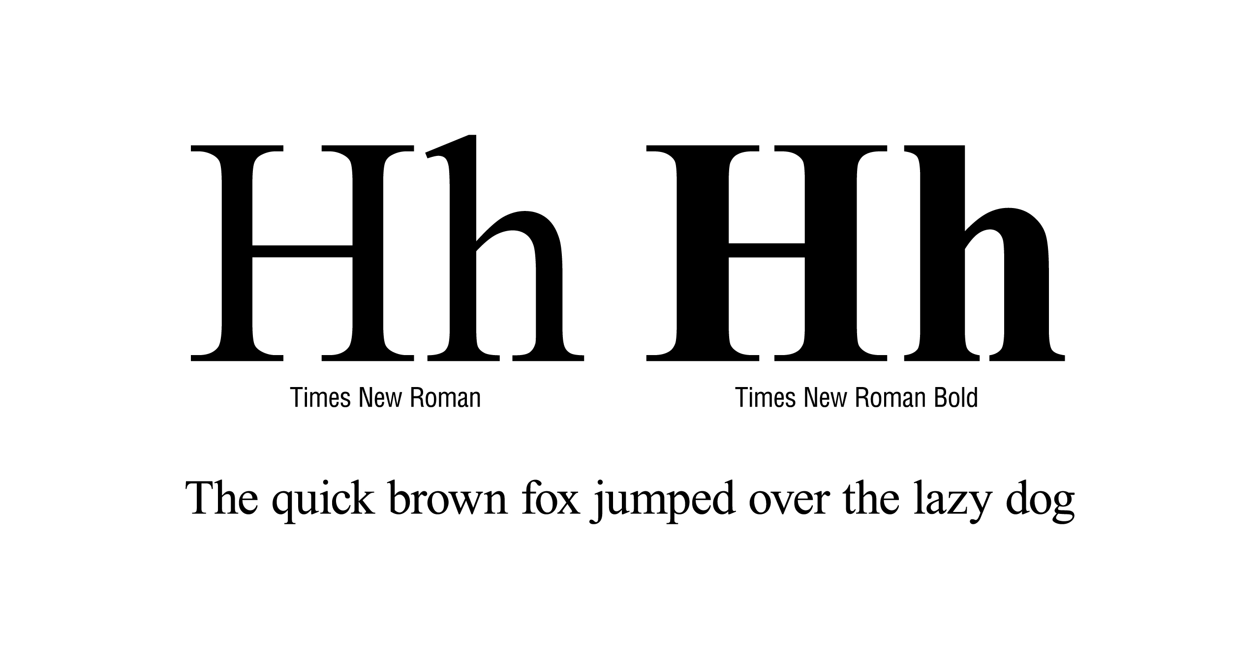
For the most computers, they come preinstalled with universal typefaces that one can choose from (known as web safe fonts), this is also utilized to replace unavailable fonts. Some common san-serif typefaces include Helvetica, Arial, Verdana and Tahoma. For serif typefaces, this can include Times, Times New Roman, and Georgia. Now for picking your website’s font family, you can go the safe route and stick with the common route and choose from the standard fonts available to most computers or you can do something different. Google has had a great tool called Google Fonts available to the public that makes it so that you can choose from a pool of over 100 font families that can be accessed on every computer by caching the font into the visitor’s computer when they enter the website.
Content Is Key
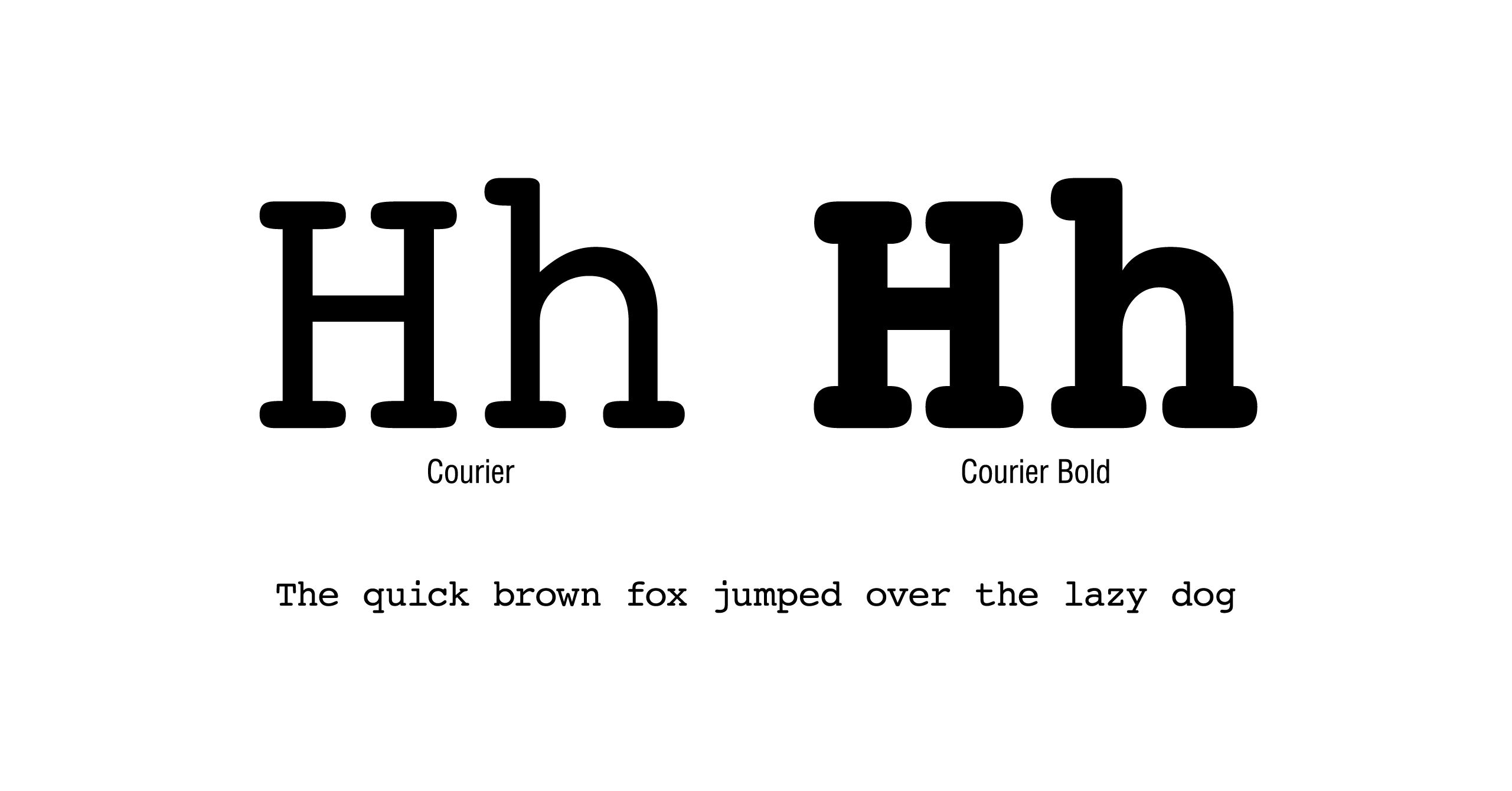
Although you may have a wide pool to choose from, you should focus on what your context is and how the typeface can match up with your content. For example, monospace types such as Courier use the same amount of width for each letter, giving it a typical computer font feel but with rounded edges. Not exactly an appropriate type for say a website selling beauty products or candy, unless somehow either of those were a techno theme. It really comes down to context, preference and not going overboard with an elaborate and illegible typeface.
Some things to consider is that the header or title typeface should be bolder or just larger to distinguish itself from the body content yet still legible. Let’s say you want to appear professional, then you would want to use a clean, solid and geometric san serif that is easy to read. Whereas if you wanted to be distinguished and hip with the youth of today you could pick a handwritten font (or indie as some might say) that wavers and flows. It’s all about content while still making it accessible to the public. Of course, there are other ways of implementing fonts even Google Fonts doesn’t have but that is for a different time.
It’s all in the details
With all that considered, it’s best to take time to consider the context of your website and how the typeface will be implemented within the content itself. Changing from a standard typeface may not appear to make leaps and bounds of a difference, but it will help push your website to feel more unique and synergize with your company’s goal.
One final piece of advice. For any reasonable business, never use the typefaces Comic Sans and Papyrus because they are the most shamefully overused fonts that should never see the light of day.
References
http://www.cssfontstack.com/ – List of Web Safe Fonts with Test
http://www.w3schools.com/cssref/css_websafe_fonts.asp – List of Web Safe Fonts
https://fonts.google.com/ – Google Fonts